





16 Best Building Construction Websites of 2026 To Use For Inspiration [UPDATED]


No single aspect of marketing is more important than a great website. In the competitive building and construction business, you need the best construction website design you can afford, that reflects your values and converts users into loyal customers. There isn’t a one-size-fits-all all template for a great construction company website, but what they do all have in common is the following eight qualities:

With this in mind, here is our list of the best construction company website design to use for inspiration. We hope that this provides the direction you need to design your new website. If you need help, please reach out to us – after all, we specialise in web design for construction companies.
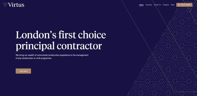
Virtus offers architectual design, commercial and office fit-out, small works and office design. Their website showcases their work really well, using a combination of icons and images. There are sleek animations within many of the sections, making this site elegant and eye catching.
The Projects sections has a practical and equally impressive display of completed jobs, with a good balance of still text and movement, appearing simply on scroll.
This site goes to show that movement can be used strategically to enhance website features when it is well thought through.
Website link- https://virtus-contracts.co.uk/
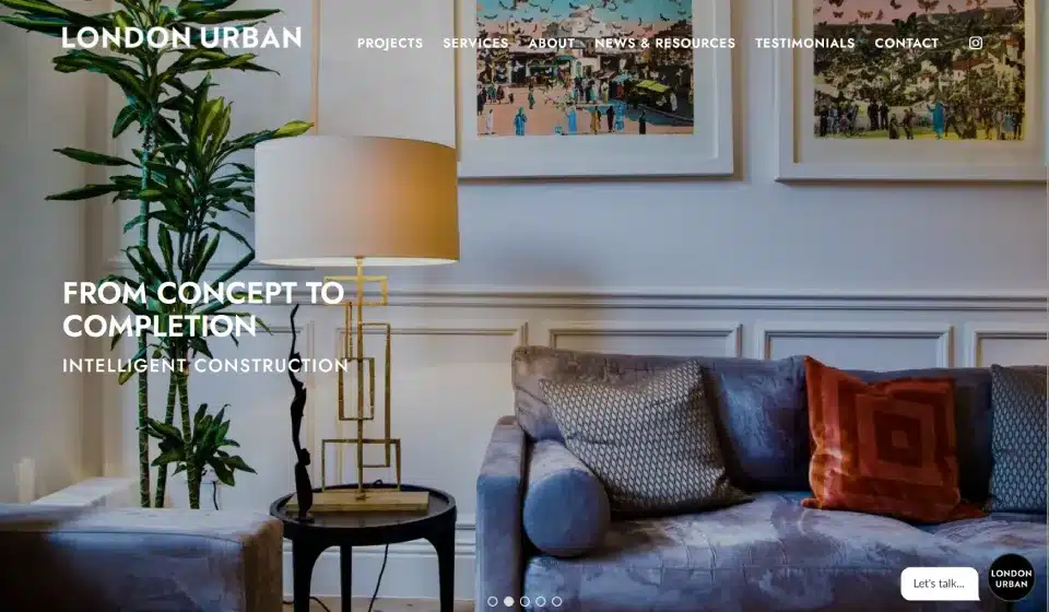
The big images on the home page are both tasteful and eye-catching. The navigation is simple and user-friendly, allowing potential clients to find what they are looking for. Each page has been carefully planned, and the high-quality images keep users engaged with the content. Every page has a clear call to action, encouraging users to interact with the company.
Website link – https://www.londonurban.co.uk/

The Reddin Construction website immediately impresses with its professional, well-organised layout and clear focus on quality services. Bold visuals and succinct page structure make it easy for visitors to understand what the company offers, from safety flooring and hygienic wall & ceiling cladding to specialist commercial finishes.
Navigation is straightforward, helping potential clients quickly locate service details, news updates, and contact information. Each section feels thoughtfully curated, with high-quality imagery and informative text that keep users engaged and informed. Calls to action are clear and inviting, encouraging visitors to get in touch or explore the company’s offerings further.
Website link – https://reddinconstruction.co.uk/
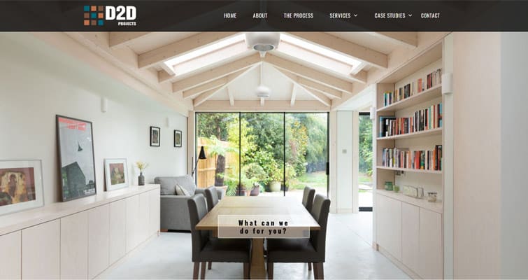
This is a good-looking website with quality, well-laid-out copy. We love the expandable headings on The Process page, enabling a large amount of content to be displayed in a clean design that conveys elegance and precision. The Contact Us pop up prompting users to call now is well designed to encourage maximum conversion, especially targeting users on mobile devices.
Website link – https://d2dprojects.co.uk/
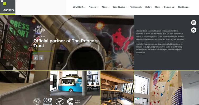
Eden London manages to include a large amount of information about their company and brand in an ordered and logical way that reinforces their expertise. We love the clickable “view our work” with down-pointing arrows that make users intrigued to explore the company’s projects and get to know them better.
Website link – https://edenlondon.co.uk/
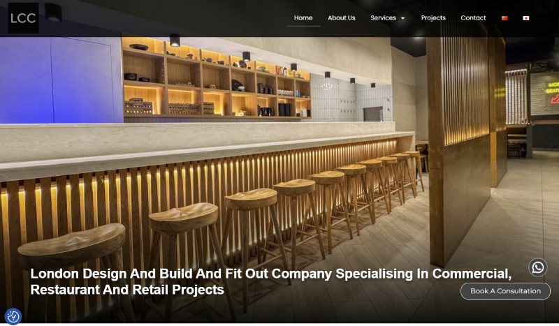
The London Construction Contractor website presents a polished and professional overview of a design and build specialist focused on commercial construction and fit-out projects. Bold visuals and a clear layout make it easy for visitors to quickly grasp the full range of services—from architectural design and interior planning to construction and final handover.
Navigation feels intuitive, guiding users through well-structured pages that showcase completed projects, service details, and practical expertise across offices, restaurants, and retail environments. The site does an excellent job of balancing engaging imagery with informative content, and clear calls to action encourage visitors to explore services or get in touch for consultations.
Website link – https://londonconstructioncontractor.co.uk/
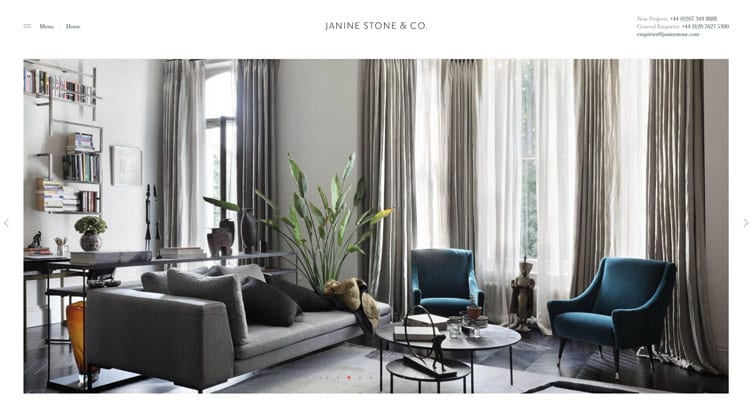
Janine Stone’s website captures their brand identity as creators of beautiful bespoke homes. The website design is clean and uncluttered. Instead of the typical menus across the top of the page, Janine Stone has a simple menu icon that opens a list of pages. We love the Our World section with content that is refreshed regularly.
Website link – https://www.janinestone.com/
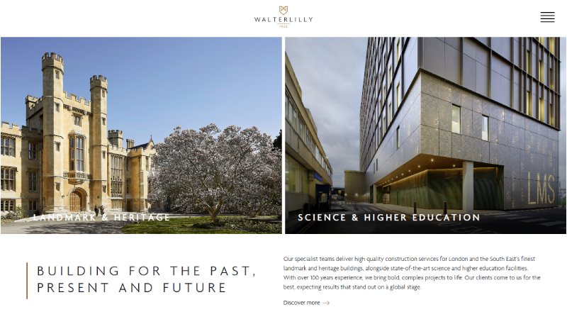
The Walter Lilly website showcases a century-strong legacy of high-quality construction and specialist building services across London and the South East. The homepage pairs striking, professional visuals with a clear message about the company’s expertise in delivering prestigious landmark and heritage restorations alongside technically demanding science and higher education projects.
Navigation is clean and easy to follow, with thoughtfully structured sections that highlight the firm’s core strengths, history, and commitment to excellence. Informative imagery and concise content help visitors quickly understand the breadth of services, while clear calls to action encourage users to explore further or get in touch.
Website link – https://www.walterlilly.co.uk/
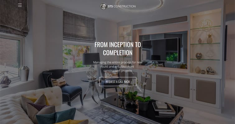
Less is more on this website. STS Construction has included content that would typically exist across several pages onto one landing page. This simplified website design helps convert users into contacts because they can find all they need to know in one place. We like the simple colour scheme of the black background with white text.
Website link – https://stsconstruction.co.uk/
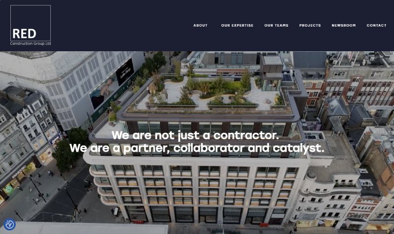
The RED Construction Group website delivers a professional and compelling overview of a specialist main contractor making its mark across the UK’s built environment. With a clean, intuitive layout and impactful visuals, the homepage clearly communicates the company’s expertise in new-build and refurbishment projects across residential, commercial, hotel, and leisure sectors.
Navigation is straightforward, helping visitors quickly explore featured projects and learn about RED’s collaborative, client-focused approach. Informative content is supported by high-quality project imagery and concise descriptions, making it easy for potential clients to understand the business’s capabilities. Strategic calls to action encourage users to delve deeper into services or get in touch for further dialogue.
Website link – https://redconstruction.co.uk/
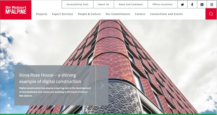
Sir Robert McAlpine is one of the largest construction firms in the UK, and their website does not disappoint. What makes this website great is that it provides a large amount of information without overwhelming visitors. As you scroll down, the background visuals are prominently placed with great use of white space to emphasise the calls to action.
This is another site with a regularly updated news section, which keeps visitors returning and helps SEO strategy. Website link – https://www.srm.com/
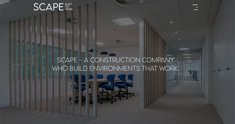
Another minimalist website where visitors simply scroll down the homepage to access the website content, perfect for users who are just browsing. To satisfy visitors looking for something in particular, the burger menu provides quick links to specific areas of the site. Visitors have short attention spans and often won’t read large amounts of text. Here, the large font size with concise text effectively conveys Scape’s brand message. Website link – https://scapeconstruct.com/

The WCS Consult website presents a crisp, professional showcase of expert construction cost planning and project consultancy services. With clean design and clear navigation, visitors can easily explore the firm’s specialised offerings in cost management, commercial advice, and strategic project support. The layout balances informative content with engaging visuals that help communicate WCS’s focus on accuracy, efficiency, and trusted industry expertise.
Each page feels thoughtfully structured, with concise copy that clearly explains services and value-driven solutions. Strong calls to action guide users toward getting in touch or learning more, making the site both user-friendly and effective at connecting potential clients with the consultancy’s capabilities.
Website link – https://wcs-consult.co.uk/

There is an art to keeping a construction website simple, but not simplistic; interesting, but not overwhelming. Bespoke Construction achieve this balance perfectly, with a harmonious colour scheme, minimal text on display, a very limited top bar menu and a well-controlled homepage. The homepage is particularly impressive, since so many in the industry can’t help listing their case studies, news stories and other tangential information, which only act as a distraction to the person browsing.
This website fits the nature of their bespoke construction services, offering a simple description, case studies and a ‘get in touch’ button to lead people through their services. There is a real sense they want to converse with their customers and treat them on a case-by-case, bespoke basis, and this is evident from the regulated amount of information provided on the website.
Website link – https://www.bespokeconstruction.co.uk/
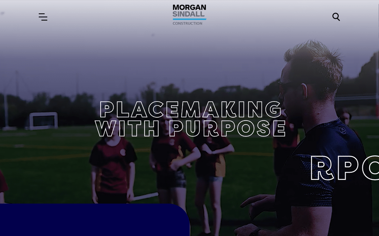
Morgan Sindall Construction (part of the Morgan Sindall Group), have a lot to say, but they say it well. You might be wondering what the best strategy is for showing your work when you are a huge company with an extensive list of projects running over many years. For Morgan Sindall, the solution was to use a video banner. They do this effectively, switching between videos of people in the environments they have built, and then moving on to sweeping overviews of the projects they have accomplished.
The rest of the website has a good balance of still text and movement, with new sections appearing simply on scroll and a stats bar that fills up as you move down the page. This site goes to show that movement can be used strategically to make a great construction website when it is well thought through.
Website link – https://www.morgansindallconstruction.com/

Last but not least, this website uses 360o walk around videos to provide an immersive user experience that keeps visitors on the web pages for longer – you really should check this one out for yourself. Almost all customers look at reviews before choosing a construction company. Here, PCC builds trust by including a section on their homepage where visitors can scroll through six different reviews by clicking through the grey dots.
Website link – https://www.pchapmanconstruction.com/
As you can see, there are no fixed rules to follow when designing your construction companies website. Whilst this gives you tremendous flexibility and opportunities to be creative, it can also feel overwhelming and make it hard to know where to start.
Here at Art Division, we have over 25 years of experience in digital marketing and can design and develop a website that will attract leads, help you win contracts and maintain excellent relationships with your customers.







"*" indicates required fields