






How to Pick & Pair Fronts for Your Website


When designing your website, it’s critical to choose a couple of fonts which work well together for your body text and titles. Doing this correctly ensures that your website is easy to read, appears on-brand, looks attractive to your customers and aligns with the rest of your web design.
It is essential to choose each font to suit your purposes, and then ensure that they work together.
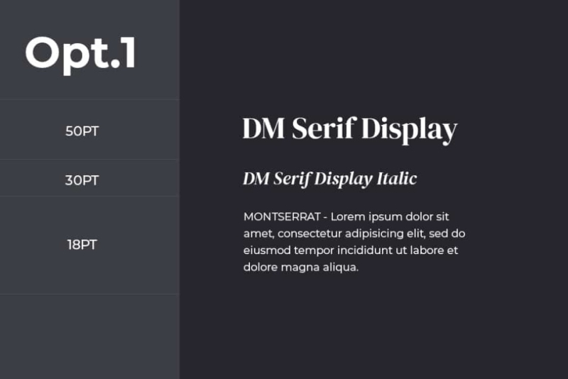
Here are the main font styles to choose from, the ‘vibe’ they give off about your brand, their common usage within different industries, and examples of these fonts which you might encounter:
| Font Style | Tone/Vibe | Common Use | Example Fonts |
|---|---|---|---|
| Serif | Formal, classic | Premium listings, luxury brands | Times New Roman, Georgia, Garamond |
| Sans-Serif | Modern, clean | Most estate agency websites, blogs | Helvetica, Lato, Open Sans, Roboto |
| Slab Serif | Bold, strong | Commercial property, masculine brands | Rockwell, Museo Slab, Courier |
| Script | Elegant, personal | Logos, invitations (use sparingly) | Great Vibes, Pacifico, Allura |
| Display | Attention-grabbing | Headlines, brand names (use with care) | Bebas Neue, Playfair Display, Lobster |
| Monospace | Technical, retro | Rarely relevant for estate agents | Courier New, Roboto Mono, Consolas |
Font combinations are simply the selection of different fonts you choose to have on your website. These should suit your design, branding elements and colour scheme. These fonts can either contrast with one another or complement one another – depending on the look you want to achieve.
Here are some key reasons why font combinations are important:
Here are a couple of ways that font combinations can – and do – go wrong on websites. The kind of mistakes are essential to avoid:
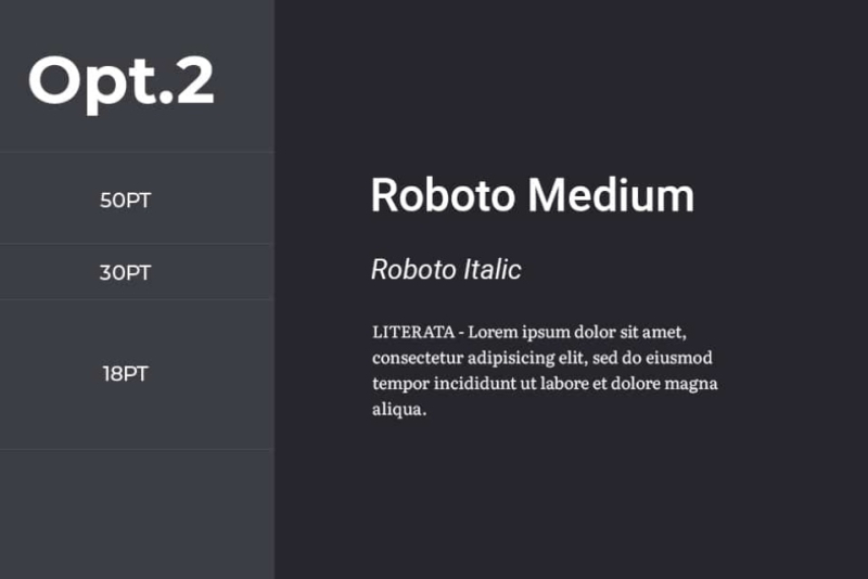
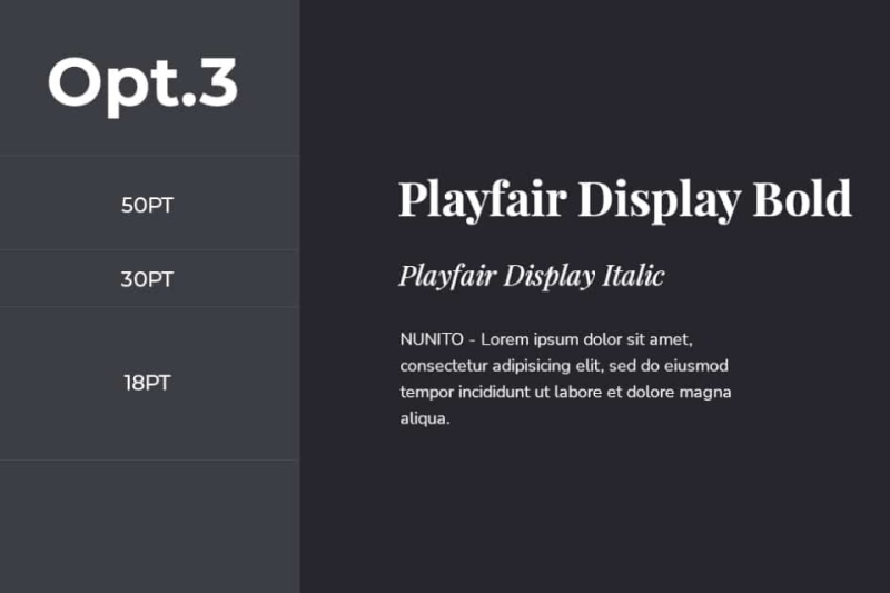
Fonts carry tone. Pick ones that match your market (e.g. family homes vs. luxury flats vs. student lets). For example:
Fancy fonts might look good in logos, but they must work on mobile and be easy to read at small sizes and render on all devices.
Avoid: Script fonts for body text, light/thin fonts in grey on white, over-stylised or novelty fonts for professional content.
Instead: Stick to Google Fonts or well-supported web-safe fonts like: Roboto, Lato, Open Sans, Merriweather etc.
You vary font weight fort extra variety on your website (e.g. light, regular, bold) to add hierarchy and contrast.
For example, you could use Roboto Bold for headings, Roboto Regular for body and Roboto Light for captions or footnotes.
This keeps branding clean and very consistent while still allowing a disciplined amount of variety.
Your fonts should clearly guide users through the page. Headings should stand out. Body text should be inviting and scannable.
Example font style and sizing structure:
Here are the most important things together when pairing fonts on your website…
‘Serif’ style fonts are designed so that they are easy to read. That is because the serif parts of the font distinguish similar letters like ‘I’ and ‘l’.
If you are writing long blog posts, or have long sections of text, it is essential to add a serif style font which is easy to read.
You may feel the need to diverge from familiar fonts like Times New Roman or Helvetica. But this is not necessary. Many people appreciate the familiarity of these fonts, so they are important to include – especially if you are tempted to use an exotic or unusual font as your other pairing.
Do you want to sound high end, down to earth, approachable, exclusive, budget focused, bespoke – or something else entirely?
Serif will make your site feel more traditional and serious, while cursive fonts look quirky and fun. Browse the table we provided earlier t0 explore the differences for yourself.








"*" indicates required fields