





11 Leaflet Ideas For Estate Agents


Flyers and leaflets are a critical way for estate and letting agents to increase their visibility. In fact, this remains the case even with the shift towards online marketing, SEO strategy and social media advertising. They help your brand appear tangible, trustworthy and prepared for business.
Even if potential customers don’t enquire directly after a leaflet drop, they are more likely to think of you when they move home or acquire a buy-to-let. This makes the traditional leaflet a must-have tool for estate agency marketing in 2026.
However, if you want your leaflets to be successful, they must follow certain guidelines. For example, they need to:
The estate agent leaflet ideas and design examples in this article accomplish each point differently, using different methods. However, they are all designed to hold the reader’s attention and drive action – whether to book a valuation or view a home.
Leaflet and flyer design is tricky, and it often costs lots of time and money to hire a designer. Even then, there can be a lot of back and forth before you settle on the final marketing materials. On the other hand, many estate agent flyer templates are dull, uninspiring and destined for the bin the moment they slip through the letterbox.
Fortunately, we’ve curated these free, easy to cusomise in Canva leaflet templates to suit any size estate or letting agency. They are designed to attract attention, and will persuade potential customers to take action.
(Image Source: The Private Postman)
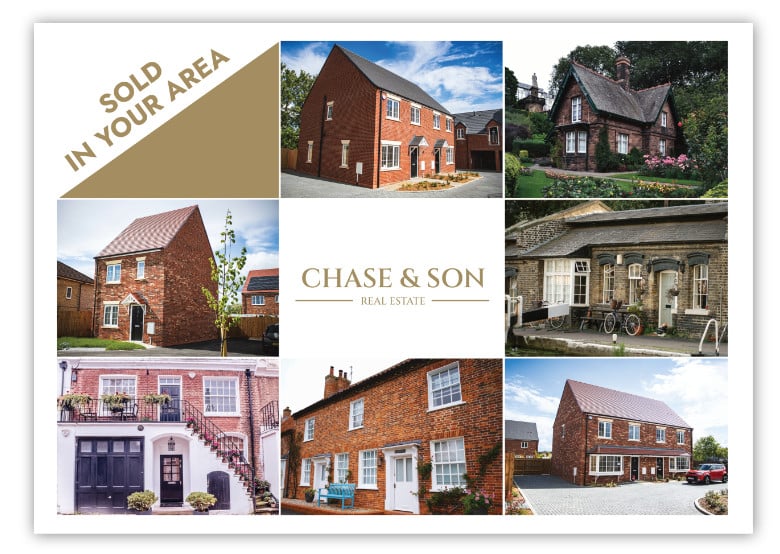
This classic leaflet is a masterclass in ‘show, not tell’. It visually showcases the work produced, without excessive text or detail. When designing a flyer, it’s tempting to say everything you can about your services and overwhelm the reader. The inevitable result is that your flier ends up in the bin. Not so with this design – it contains a total of 9 words!
It carefully showcases the different properties sold by Chase & Son, helping to filter relevant buyers and sellers. The fact it’s a montage of sold properties implicitly builds confidence in the brand, and demonstrates their service record when it comes to selling.

(Image source Ravensworth)
This is a striking design which tells the house-buyer’s story. Once again, it communicates visually and with minimal text. The image of the toys on the line playfully implies the lack of space in the buyer’s home, and zones in on their reasons to sell up and move on.
Like the previous example, the agents are confident enough not to include their address or email – saving space and resisting visual clutter. This works well when the agent knows their audience, for example: young buyers who will search for their brand name online, or buyers in a tiny community who would have walked past the shop window.

(Image source Print-Print)
Sometimes, more is better. Your leaflets don’t need to be nine words on a single side of A6, in fact, they can be double-sided and offer a lot of information – so long as it’s easy to follow and relevant.
This Winkworth leaflet does this very well. The design is very plain, using only a couple of colours and the text formatting is uniform across each bullet point section. This means that the large amount of text is easy to read without being distracted by other visual elements.

(Image source Creative Market)
How do you promote an individual property without saying too much? This example maintains the balance well. The visuals do the heavy lifting, with carefully placed icons and attractive photography. Rather than bombarding the reader with every single positive about the home – there is a short summary which piques curiosity and invites a viewing.
Equally, an attractive leaflet for one great property implies you have further properties of the same quality. If you do it right (like this leaflet), you might attract buyers who are willing to explore your offering even if they don’t want that particular property.

(Image source EZ Muve)
Some of the best leaflets combine minimal visuals and text. To get this right, you must ensure every image and word says something relevant and captivating. Too much text leads people to ignore it, and too little means it looks sparse and boring.
This is an excellent example of a minimalist estate agency leaflet. It focuses on one thing only: persuading people to get a property valuation. This combines exceptionally well with the simple colour scheme, a small amount of text and one relevant image.

(Image source xHeight Brand Design Agency)
Sometimes, it’s best to get creative with your leaflet design. Even if your services are rather plain, a creative touch can get vendors and landlords to view you positively. Creative leaflets are memorable and fun, keeping your brand top-of-mind and easy to engage with. Nurturing this relationship with your customers is a great way to get more leads.
The optician board in this example is a great way to combine copy and imagery. It’s unusual and grabs your attention with the blurred text at the bottom. It’s then supported by short (and crystal clear) copy that calls vendors and landlords to try out their services instead.

(Image source Leanne Kent Property)
Example 7 set a high bar for a minimalist combo of text and imagery. But what about a high-quality, long-form leaflet?
This example adds more elements to the design, but not so much that it becomes distracting. The designer achieves this with a simple, two-tone colour scheme and careful text sizing. Each bit of text is enlarged according to its importance, with contact details and the primary CTA’s outweighing the body text by far (which is in a tiny font). This contrast ensures that the reader pays attention to what’s important without distraction. Then, if they want, they can read the finer details.

(Image source Prestige Creative)
Run-of-the-mill leaflets are easily chucked in the bin without a second thought – but fancy shapes or interesting material can give people pause.
This key-shaped leaflet is highly unusual, and immediately attracts attention since it’s likely that nothing else in your letterbox will look like it. This is a great way to attract customers distinct from your copy or on-paper design. It’s bound to get a second look, and makes your brand stand out from competitors’ leaflets.

(Image source Prestige Creative)
It takes a lot of courage to create a text-only design. Most designers are itching to add a photo or a slew of fancy visuals so their leaflets look credible. But that’s not the only way.
In fact, this example proves that text alone can make for a clean, elegant, attractive design. The most important text is carefully arranged (i.e. £500 cashback and property awards logo) and the body text is subtly contained between these essential elements. Once again, the sizing of text is crucial, with the most critical parts sized up and the body text scaled down.

(Image source Prestige Creative)
It can be hard to come up with an eye-catching design – but your leaflet can succeed even without the visual fanfare.
This example is visually basic; you could create it with simple tools on an average PC. But, it’s very well arranged and the copy is excellent. Yet again, the critical text is sized accordingly, with the attractive 1% fee the largest part of the leaflet. Each bit of text communicates the estate agent’s unique offer, from their promise to sell homes in 90 days, to the option to halve the fee if they fail to do so.

(Image source Prestige Creative)
Seasonal leaflet design can be an effective way for local estate agents to attract attention and enhance brand visibility during key periods like Christmas or Easter. By incorporating festive themes, colours, and imagery relevant to the season, these leaflets create an immediate visual appeal that stands out from everyday marketing materials. For instance, Christmas-themed leaflets with warm, inviting tones or Easter-inspired designs with fresh, spring colours can evoke positive emotions and make the brand feel more approachable and in tune with the community’s spirit.
This seasonal touch not only helps capture the audience’s attention but also reinforces the estate agent’s local presence, positioning them as an active, relatable part of the neighbourhood.
Only talk about your agency as much as you need to. There are better places to explain all your services than a leaflet, instead, you should aim to capture the reader’s attention as quickly as possible. If you don’t, it’s likely your flyer will end up in the bin.
Some agents want to say everything great about their services on a single A6 leaflet. That just won’t work. You must narrow your offer to keep your leaflets clear, engaging and understandable. If you don’t, readers will miss the point, get overwhelmed and throw your flyer away.
The best way to do this is to make one single point: whether it’s a simple promotion, sales service, letting service or limited offer. That doesn’t mean you say one sentence and leave the rest blank. Rather, you headline and explain one point throughout – across your headings, body text and call to action.
That way, readers will understand your message and take the appropriate next steps.
Text should always be sized according to importance, with the main headline significantly larger than the (less important) body text. Equally, the headline must capture attention immediately. For example, it’s unwise to make the largest headline the name of your estate agency, because it doesn’t communicate any benefits to the reader.
Text must be divided into clear, readable chunks that are easy to skim read and don’t distract from the main message. Use bullet points, numbered lists, and short paragraphs to achieve this.
Some leaflets are image-heavy, and others aren’t. Either way, images are a great way to communicate your message. This is true, whether your images show a montage of elegant, sold properties, or visual icons (like a phone) which direct people to call or send you a message.
If you use images and icons well, you won’t have to say as much. That way, your leaflet will capture attention easily and readers will take the action you want them to take.
To do this, you’ll need to pick one or two brand colours and stick to them throughout your leaflet. It’s similar to the text – use the brightest colours where you want to attract the most attention, and let the finer details fade into the background. This means readers can choose to investigate further – but they’re not bombarded with excessive visual shenanigans from the moment they see your leaflet.
You’ll need to consider the material of your leaflet carefully. The golden rule is to use materials that back up your brand and leaflet offer. For example, thick, robust card is often used by luxury brands, while thin, glossy paper is more common for everyday promotions.
It’s best to order a couple of leaflets to test out the best materials. That way, you can feel if the paper is too thin and floppy, or whether the graphic design translates well onto the paper surface. The last thing you want to do is appear cheap, tacky and unprofessional. Equally, you can experiment with shaped leaflets to make your design stand out.
The best leaflet ideas are shaped around who you are trying to reach. If you are targeting sellers, showing recently sold properties or sharing local market figures can be very effective. For landlords, focus more on rental demand and how you support them. Always consider what matters most to homeowners in your specific area.
Popular sizes such as A5 or A6 are practical and affordable for regular distribution. These formats are easy to deliver and familiar to recipients. It is worth testing different layouts or finishes to see what works best in your local market.
You can track results by using dedicated phone numbers, unique email addresses, QR codes or specific offers printed on the leaflet. These simple tools make it easier to see which leaflet campaigns are generating enquiries and which ideas are worth repeating.
Yes, estate agent leaflets can still be very effective when done properly. While online marketing plays a big role, leaflets offer something tangible that homeowners can physically keep. When combined with strong design, a clear message and consistent distribution, leaflets remain a reliable way to stay visible in your local area and generate instructions.
There is no exact figure that suits every estate agent, as results depend on your area, budget and objectives. What tends to make the biggest difference is regular exposure rather than a single large drop. Many agents see better results by delivering leaflets to the same neighbourhoods on a monthly or quarterly basis, gradually building recognition and trust over time.
Designing your estate agency leaflets takes time and thought. If you decide upon your message and copy in advance, you can create a design quickly and with better direction. Once you combine your clear message with the design tips in this article, you’ll be well-positioned to spread the word and distribute leaflets around your local area.
And if you need more help with your estate agency marketing, why not find out how we can grow your agency by booking a call with us.







"*" indicates required fields