





What converts? The psychology behind the call to action


If you feel like your campaigns aren’t quite hitting the mark, your conversion rates are dwindling, or the response from your audience is quieter than tumbleweed, don’t despair. Sometimes, it’s hard to know how to boost interest, but the answer could be as simple as beefing up your call to action.
Whenever you communicate with your customers, your call to action (CTA) is the most important message you’ll deliver. Some marketers would argue that without it, you probably shouldn’t bother.
Your call to action is all about persuasion. Whether you want people to sign up for your newsletter, download a brochure, book an appointment or make a purchase, your CTA needs to get them to take that crucial next step. It’s also about getting them to do so NOW – not at some random point in the future.
The success of your CTA lies in the psychology behind people’s behaviour. It’s about understanding the impulses that make them take action and the messages that stimulate those impulses.
Behavioural psychology is a complex area, obviously, but there are some simple rules you can follow to pique interest and encourage action, regardless of the marketing platform you’re using.
In fact, while communication methods have changed rapidly over the past decade, many of the most effective call to action messages are similar to those used in early advertising and direct mail created a century ago.
The answer to this is anywhere you know your audience will look.
You might think of a call to action as something that comes at the end of a piece of content – a summing up of your argument. This can often be the case. A CTA is a great finish to a well-argued blog or informative video, for example.
Equally though, a CTA can be placed anywhere on a website or within an email or social media post. It can be copy, but more likely it will be a banner, image, button, or other visual cue to click through to the next stage.
Behavioural psychology is complex, and while we can only scratch the surface of the things that make people respond to a call to action, there are a few factors you should bear in mind …
Have the purpose of your call to action at the front of your mind at all times as you construct your landing page or write your email or design your post – everything should build up to that all-important CTA.
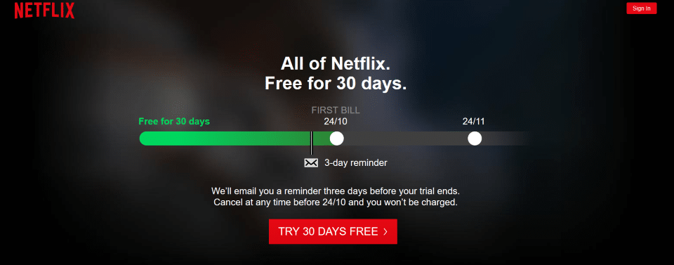
Do this by removing the barriers people may have to responding to your call to action. Free trials, no obligation, cancel at any time, limited offers all give your audience the confidence to take the step now, safe in the knowledge that they won’t be locked into something further down the line.
This Netflix landing page is a good example – with a warning system in place, what could possibly stop someone taking the no obligation 30-day trial?
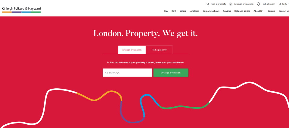
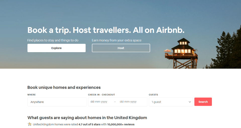
There are lots of different ways of expressing your call to action, but make sure you’re clear and explicit about what you are asking of people. Good call to action button messages include:
These all explain what you want people to do and are better than vague commands such as ‘click here’ or ‘find out more’.
Such as this landing page from estate agent KFH…
Or this one from Airbnb…
Be careful, however, not to force people to take action. Avoid pop-ups where the only way out is conversion – you could scare them away from your site altogether.
Depending on your audience, the right phrases or wording can make all the difference to your conversion rates. For example, the word ‘free’ will be enticing to most visitors. So if what you’re offering is free, use this word.
Your copy needs to evoke a sense of urgency, be clear, pithy, personal, action-orientated, and unequivocal in meaning.
Create the impression that there is a limited supply of whatever it is you’re offering and a limited time to take up the offer – such as this email.
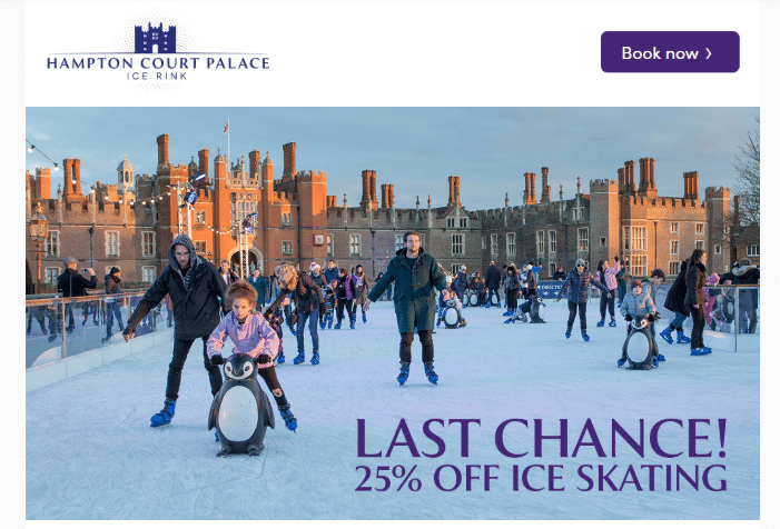
Try the ‘so what’ test to make sure the content is clear – if the benefits aren’t obvious, keep asking ‘so what’ until you’ve nailed them.
Words which have resonated with audiences down the decades, and still work today, include now, new, guarantee, hurry, last chance, limited, today only and, sign up.
Remember, even if you’ve decided to take a creative or quirky route with your copy, the call to action must be clear and unequivocal.
Such as this one from, US home insurer Lemonade…
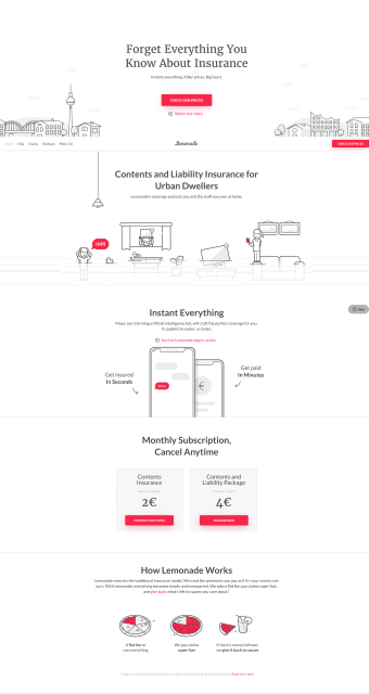
Much has been written about the psychology of colour – blue is said to signify trust, while green is associated with health and growth. Red is good for impact – you’ll often see it on act or donate now buttons but it can mean danger too. Consider colour choice, but make sure any CTA button works with the background colour of your page and your own branding too.
The same goes for your typeface. First, make it legible. Using a different font to the rest of the page will help your CTA stand out but it needs to work with your brand and complement any other fonts on the page.
A picture tells a thousand words, so make sure it’s relevant and emotive enough to drive action. This is particularly true when it comes to Facebook or Instagram.
It might be good to have your CTA upfront and noticeable (above the fold) but placing it after your audience has read and absorbed your messages (below the fold) often works too. You may need to audience test your placement for the best result.
This website from Partridge Homes is an example of an above-the-fold CTA.
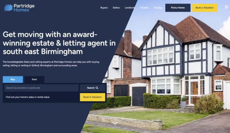
Make sure your CTA stands out and is noticed, but not so much that it obscures everything else on the page.
Curves and rounded edges are pleasing to the eye and draw attention – again, it’s worth testing this out to see what works best on your page.
Remember, you want users to come to your landing page and you don’t want them to leave without taking action. So, your entire landing page should be built around the CTA.
Placement is important, and a logical flow of information through to the CTA should leave users in no doubt of what they can expect if they click on your CTA. You need to make it easy and simple for users to take action – be persuasive.
For example, this page by YesCanDo. You can see that not only do they have two distinctive buttons and positive reviews, but also use WhatsApp to entice engagement.
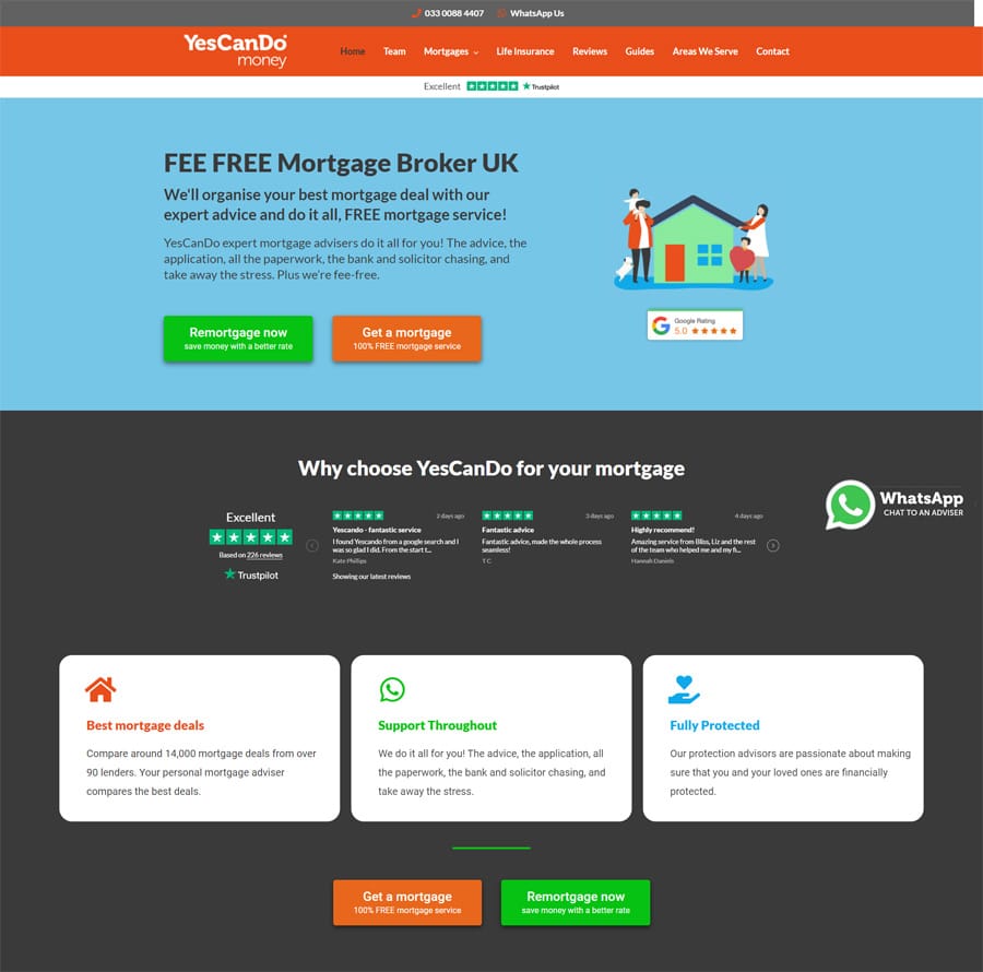
A successful landing page should have these elements:
While much of the advice about constructing a good CTA applies across platforms, there are some subtle differences to apply when it comes to social media. With limited space and the need to halt the scrolling with a high impact post, keep your copy punchy, succinct and engaging and your images top quality and arresting.
These tips apply to Twitter CTAs but also to Facebook and Instagram…

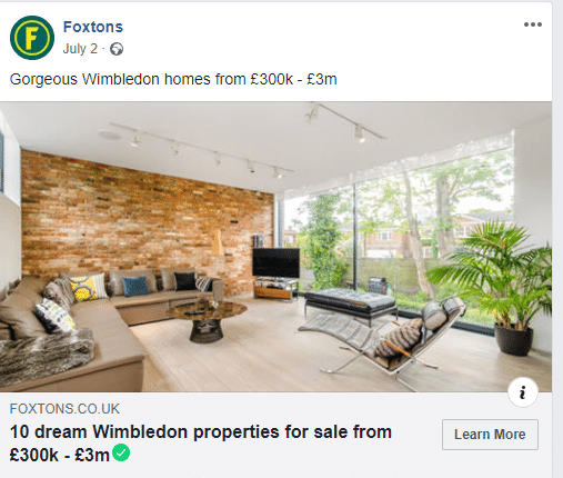
For example, this post from John Lewis:
While you might be sure your content and call to action will result in multiple conversions, you absolutely must test this out first.
A/B testing, which is also known as split testing or bucket testing, will enable you to see what performs well and what doesn’t. What works for one campaign page might not work for another. The best practice approach is to conduct A/B testing and be guided by the results.







"*" indicates required fields